
Menu
Work
About
Contact
Bridging Design & Engineering for Enterprise FinTech
Architecting a scalable, token-based design system to drive a company-wide rebrand, unifying four fragmented enterprise platforms while establishing strict accessibility and engineering standards.
Client
Cardinal Financial (Enterprise FinTech)
Team
4 Designers, 0 Product Managers
Role
Product Designer for Design System
Timeline
3 Months (Strategic cancellation of a 5-month planned roadmap)
The Mandate & The Constraints

The System We Inherited
The legacy Kinetic system was highly fragmented. To support a comprehensive company rebrand, we needed to modernize the architecture across four distinct platforms: Octane, PLQ, the marketing site, and the Borrower's Dashboard.

Resource Constraints
To accelerate an aggressive 5-month roadmap, four product designers worked concurrently. However, we operated entirely without dedicated Product Managers or formal user research tools, requiring strict cross-functional discipline.

The Strategy
Without traditional user testing, I pivoted our approach. I anchored our design decisions in heuristic evaluations, strict WCAG AA compliance standards, and tight engineering alignment to establish objective benchmarks for quality.
Pillar 1
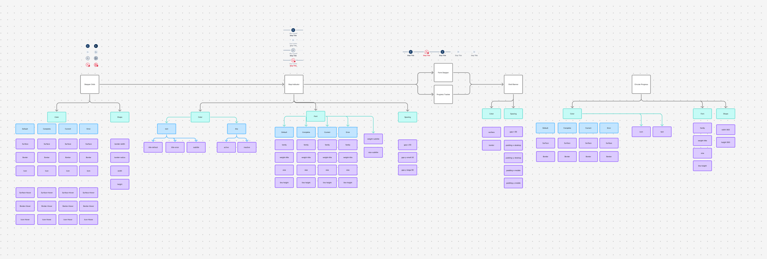
Architecting for Scale
Atomic Design & Semantic Tokens
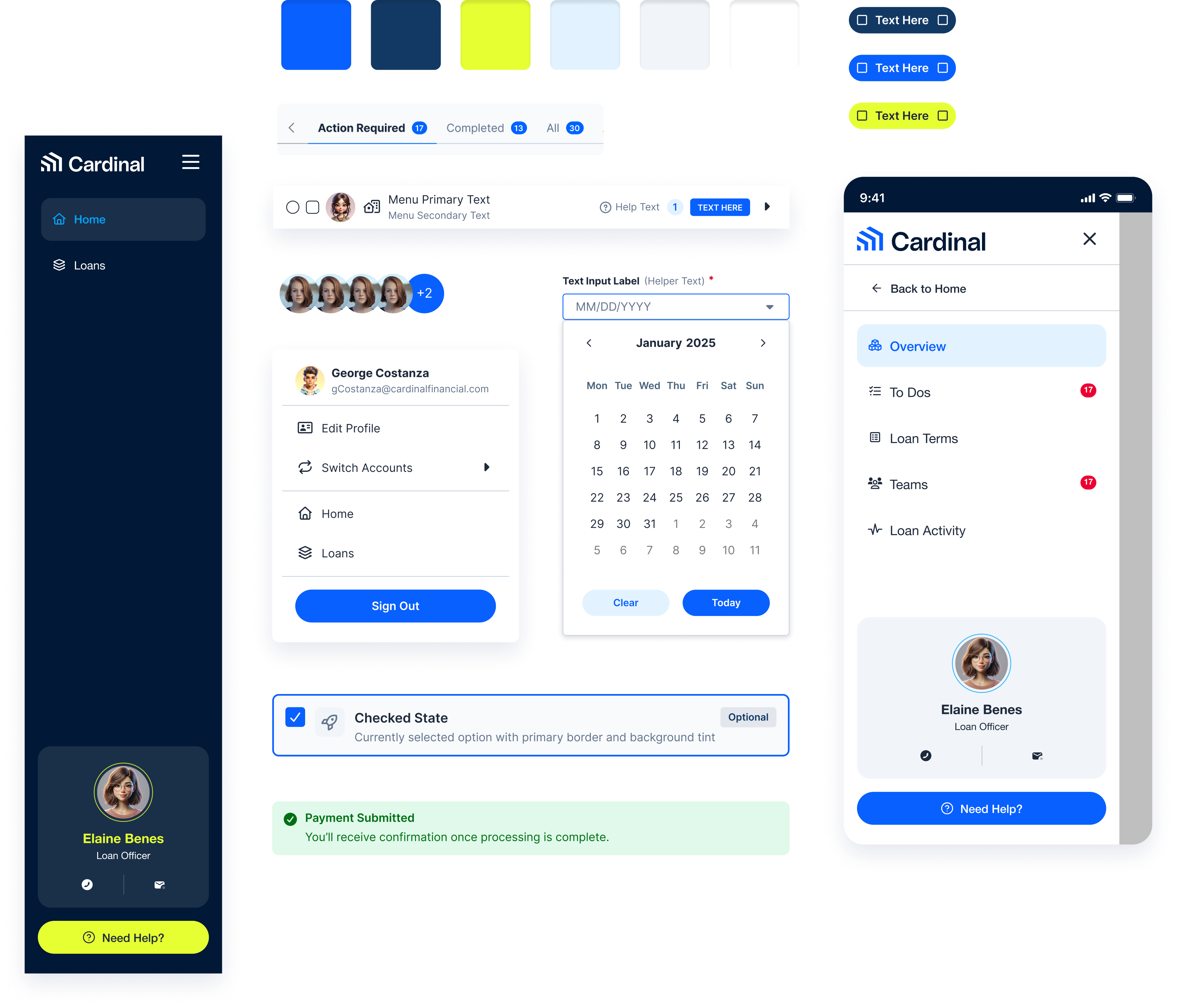
I structured components using atomic design principles, starting from primitive tokens (colors, spacing, typography) to composite patterns (cards, navigation, forms).
Token-Based Theming: Standardized semantic tokens (e.g., color-bg-interactive, text-inverse) across all components to ensure absolute visual consistency and seamless scalability across the four distinct product platforms.
Accessibility-First Foundations: Baked WCAG AA compliance directly into the primitive layer. By standardizing color pairs at the token level, contrast ratios were inherently solved before components were ever assembled into page layouts.
Component Ownership & Handoff: Took full ownership of the logic and developer documentation for core foundational elements, including buttons, badges, plaques, form stepper, progress tracker, and global header.. etc.
Pillar 2
Engineering Accessibility
Designing the Edge Case (The 3-Layer Stack)
Dynamic marketing images uploaded by users routinely failed WCAG AA contrast standards when overlaid with text. To ensure accessibility regardless of asset loading status, the Image Banner component is built as a stack of three independent layers.
The Handoff: The "Waterfall" Fallback Flow
Translated the UI into pure CSS stacking logic. In the ideal state, the image loads and the dark overlay ensures text contrast. If an image fails to load, the background gradient becomes visible underneath. The dark overlay remains to darken the gradient further, maintaining the exact same text contrast ratio. As a final safety, the background gradient is dark enough on its own to support white text.
Scrim Layer
Scrim Layer
z: 100
z: 50
z: 1
1
Content Layer
z-index: 100
Holds the Text and Buttons. For the default dark theme, this utilizes Text-Inverse (White)
2
Scrim Layer
z-index: 50
Overlay Effect
The Safety Overlay. A semi-transparent Scrim (Dark or Light) that sits between text and background
3
Base Layer
z-index: 1
Gradient Background
The Container Background. This holds both the primary Image and the CSS Gradient (fallback).
Pillar 3
Navigating Ambiguity & Leadership
Driving Velocity & Protecting the Timeline
Without a Product Manager, our team of four designers risked disorganized handoffs and missed engineering deadlines. After finishing my foundational components ahead of schedule, I shifted focus to unblock the rest of the team. I stepped in to take over 10+ delayed projects from my peers — including complex form controls and comprehensive token documentation.
By actively managing this workload, I kept the engineering pipeline moving and ensured we stayed on track for our aggressive 5-month launch target.
Disagree & Commit (Navigating Tradeoffs)
For "disabled" card states, I advocated for a standard 50% opacity approach. This ensures any color-coded badges placed inside the card retain their visual meaning, both now and in the future. The Lead Designer, however, preferred a flat gray override to match the legacy system. After clearly explaining the UX tradeoff—that users would lose helpful color categorization—I fully committed to the gray direction. Keeping the team aligned and the project moving fast is ultimately more important than winning a design debate.
The Outcome & Reflection
The Business Pivot
We successfully delivered the foundational architecture and reached our first live integration milestone. At that exact moment, leadership made a strategic decision to adopt an off-the-shelf library to accelerate the company-wide rebrand.
The Takeaway
A sudden business pivot isn't a failure—it's a test of the system's foundation. The real ROI of the BluePrint Design System project wasn't just the UI components; it was the organizational maturity it left behind. By establishing a shared technical language, the team was perfectly primed to integrate the new library on day one without losing momentum.
Value Delivered:
- Mapped raw UI to semantic tokens, bridging the gap between design and front-end engineering.
- Accessible by Default: Baked WCAG AA compliance directly into the component logic and fallback states.
- Cross-Functional Velocity: Proactively managed timelines and absorbed backlogged work to protect engineering delivery dates.
Thanks for stopping by!
Want to create something awesome? Drop me an email.
© Michelle Ko 2025
Want to create something awesome? Drop me an email.
CONTACT
DOWNLOAD
Resume
PROJECTS
Childcare Mobile Apps
Enrollment Enhancement
Digital Key
Cart and Check Out Page

Other Projects
Project
Building a Connected Childcare Ecosystem
See Project
→
Project
Empowering Admins with Data-Driven Enrollment Tools
See Project
→
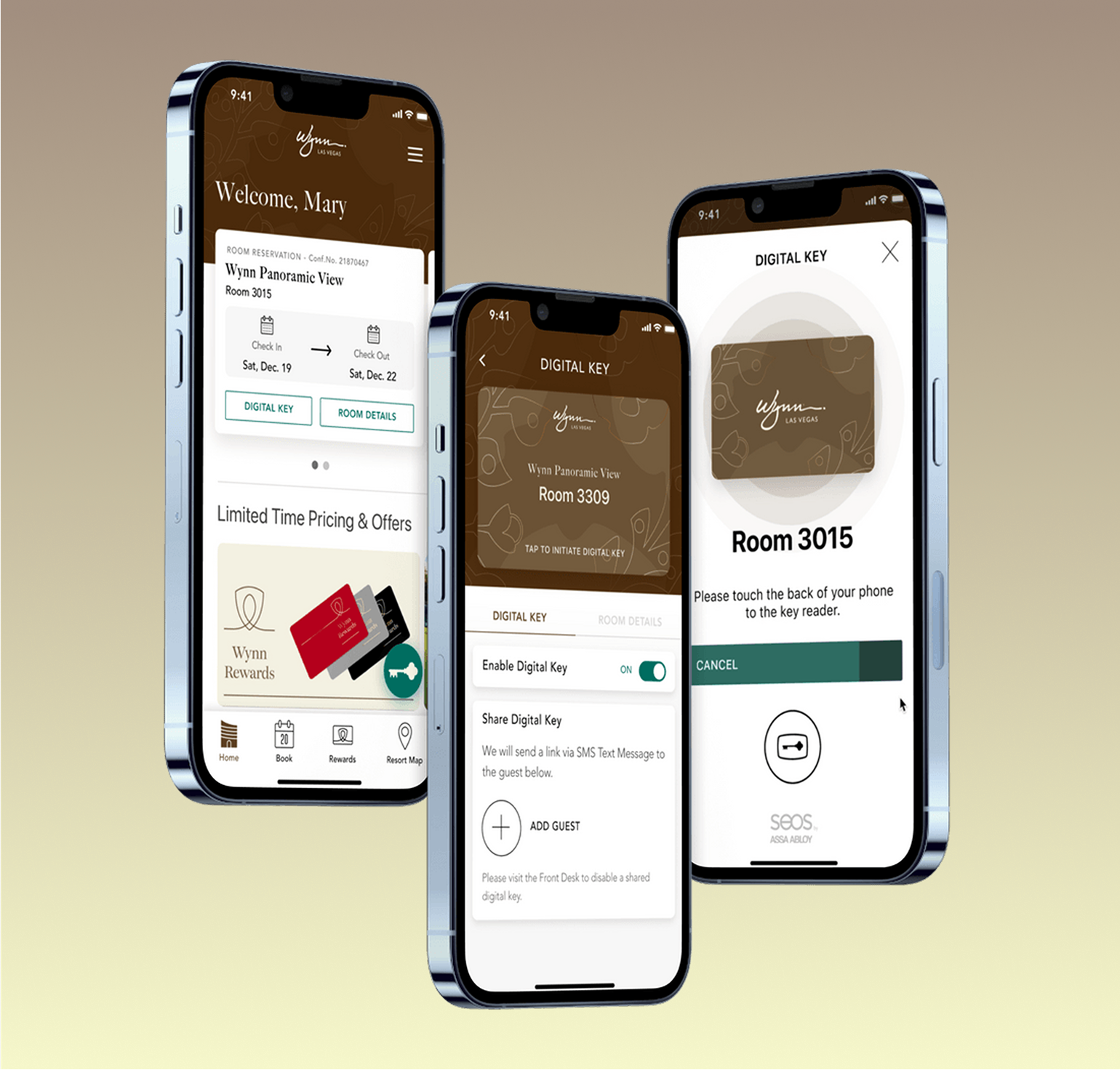
Project
The Key to a Better Stay: Designing a Mobile-First Welcome Experience
See Project
→
Work
About
Contact
Bridging Design & Engineering for Enterprise FinTech
Architecting a scalable, token-based design system to drive a company-wide rebrand, unifying four fragmented enterprise platforms while establishing strict accessibility and engineering standards.
Client
Cardinal Financial (Enterprise FinTech)
Team
4 Designers, 0 Product Managers
Role
Product Designer for Design System
Timeline
3 Months (Strategic cancellation of a 5-month planned roadmap)
The Mandate & The Constraints
The System We Inherited
The legacy Kinetic system was highly fragmented. To support a comprehensive company rebrand, we needed to modernize the architecture across four distinct platforms: Octane, PLQ, the marketing site, and the Borrower's Dashboard.
Resource Constraints
To accelerate an aggressive 5-month roadmap, four product designers worked concurrently. However, we operated entirely without dedicated Product Managers or formal user research tools, requiring strict cross-functional discipline.
The Strategy
Without traditional user testing, I pivoted our approach. I anchored our design decisions in heuristic evaluations, strict WCAG AA compliance standards, and tight engineering alignment to establish objective benchmarks for quality.
Pillar 1
Architecting for Scale
Atomic Design & Semantic Tokens
I structured components using atomic design principles, starting from primitive tokens (colors, spacing, typography) to composite patterns (cards, navigation, forms).
Token-Based Theming: Standardized semantic tokens (e.g., color-bg-interactive, text-inverse) across all components to ensure absolute visual consistency and seamless scalability across the four distinct product platforms.
Accessibility-First Foundations: Baked WCAG AA compliance directly into the primitive layer. By standardizing color pairs at the token level, contrast ratios were inherently solved before components were ever assembled into page layouts.
Component Ownership & Handoff: Took full ownership of the logic and developer documentation for core foundational elements, including buttons, badges, plaques, form stepper, progress tracker, and global header.. etc.
Pillar 2
Engineering Accessibility
Designing the Edge Case (The 3-Layer Stack)
Dynamic marketing images uploaded by users routinely failed WCAG AA contrast standards when overlaid with text. To ensure accessibility regardless of asset loading status, the Image Banner component is built as a stack of three independent layers.
The Handoff: The "Waterfall" Fallback Flow
Translated the UI into pure CSS stacking logic. In the ideal state, the image loads and the dark overlay ensures text contrast. If an image fails to load, the background gradient becomes visible underneath. The dark overlay remains to darken the gradient further, maintaining the exact same text contrast ratio. As a final safety, the background gradient is dark enough on its own to support white text.
Scrim Layer
Scrim Layer
z: 100
z: 50
z: 1
1
Content Layer
z-index: 100
Holds the Text and Buttons. For the default dark theme, this utilizes Text-Inverse (White)
2
Scrim Layer
z-index: 50
Overlay Effect
The Safety Overlay. A semi-transparent Scrim (Dark or Light) that sits between text and background
3
Base Layer
z-index: 1
Gradient Background
The Container Background. This holds both the primary Image and the CSS Gradient (fallback).
Pillar 3
Navigating Ambiguity & Leadership
Driving Velocity & Protecting the Timeline
Without a Product Manager, our team of four designers risked disorganized handoffs and missed engineering deadlines. After finishing my foundational components ahead of schedule, I shifted focus to unblock the rest of the team. I stepped in to take over 10+ delayed projects from my peers — including complex form controls and comprehensive token documentation.
By actively managing this workload, I kept the engineering pipeline moving and ensured we stayed on track for our aggressive 5-month launch target.
Disagree & Commit (Navigating Tradeoffs)
For "disabled" card states, I advocated for a standard 50% opacity approach. This ensures any color-coded badges placed inside the card retain their visual meaning, both now and in the future. The Lead Designer, however, preferred a flat gray override to match the legacy system. After clearly explaining the UX tradeoff—that users would lose helpful color categorization—I fully committed to the gray direction. Keeping the team aligned and the project moving fast is ultimately more important than winning a design debate.
The Outcome & Reflection
The Business Pivot
We successfully delivered the foundational architecture and reached our first live integration milestone. At that exact moment, leadership made a strategic decision to adopt an off-the-shelf library to accelerate the company-wide rebrand.
The Takeaway
A sudden business pivot isn't a failure—it's a test of the system's foundation. The real ROI of the BluePrint Design System project wasn't just the UI components; it was the organizational maturity it left behind. By establishing a shared technical language, the team was perfectly primed to integrate the new library on day one without losing momentum.
Value Delivered:
- Mapped raw UI to semantic tokens, bridging the gap between design and front-end engineering.
- Accessible by Default: Baked WCAG AA compliance directly into the component logic and fallback states.
- Cross-Functional Velocity: Proactively managed timelines and absorbed backlogged work to protect engineering delivery dates.
Thanks for stopping by!
© Michelle Ko 2026
Want to create something awesome? Drop me an email.
CONTACT
DOWNLOAD
Resume
PROJECTS
Childcare Mobile Apps
Enrollment Enhancement
Digital Key
Cart and Check Out Page

Other Projects
Project
Building a Connected Childcare Ecosystem
See Project
→
Project
Empowering Admins with Data-Driven Enrollment Tools
See Project
→
Project
The Key to a Better Stay: Designing a Mobile-First Welcome Experience
See Project
→
Work
About
Contact
Bridging Design & Engineering for Enterprise FinTech
Architecting a scalable, token-based design system to drive a company-wide rebrand, unifying four fragmented enterprise platforms while establishing strict accessibility and engineering standards.
Client
Cardinal Financial (Enterprise FinTech)
Team
4 Designers, 0 Product Managers
Role
Product Designer for Design System
Timeline
3 Months (Strategic cancellation of a 5-month planned roadmap)
The Mandate & The Constraints
The System We Inherited
The legacy Kinetic system was highly fragmented. To support a comprehensive company rebrand, we needed to modernize the architecture across four distinct platforms: Octane, PLQ, the marketing site, and the Borrower's Dashboard.
Resource Constraints
To accelerate an aggressive 5-month roadmap, four product designers worked concurrently. However, we operated entirely without dedicated Product Managers or formal user research tools, requiring strict cross-functional discipline.
The Strategy
Without traditional user testing, I pivoted our approach. I anchored our design decisions in heuristic evaluations, strict WCAG AA compliance standards, and tight engineering alignment to establish objective benchmarks for quality.
Pillar 1
Architecting for Scale
Atomic Design & Semantic Tokens
I structured components using atomic design principles, starting from primitive tokens (colors, spacing, typography) to composite patterns (cards, navigation, forms).
Token-Based Theming: Standardized semantic tokens (e.g., color-bg-interactive, text-inverse) across all components to ensure absolute visual consistency and seamless scalability across the four distinct product platforms.
Accessibility-First Foundations: Baked WCAG AA compliance directly into the primitive layer. By standardizing color pairs at the token level, contrast ratios were inherently solved before components were ever assembled into page layouts.
Component Ownership & Handoff: Took full ownership of the logic and developer documentation for core foundational elements, including buttons, badges, plaques, form stepper, progress tracker, and global header.. etc.
Pillar 2
Engineering Accessibility
Designing the Edge Case (The 3-Layer Stack)
Dynamic marketing images uploaded by users routinely failed WCAG AA contrast standards when overlaid with text. To ensure accessibility regardless of asset loading status, the Image Banner component is built as a stack of three independent layers.
The Handoff: The "Waterfall" Fallback Flow
Translated the UI into pure CSS stacking logic. In the ideal state, the image loads and the dark overlay ensures text contrast. If an image fails to load, the background gradient becomes visible underneath. The dark overlay remains to darken the gradient further, maintaining the exact same text contrast ratio. As a final safety, the background gradient is dark enough on its own to support white text.
Scrim Layer
Scrim Layer
z: 100
z: 50
z: 1
1
Content Layer
z-index: 100
Holds the Text and Buttons. For the default dark theme, this utilizes Text-Inverse (White)
2
Scrim Layer
z-index: 50
Overlay Effect
The Safety Overlay. A semi-transparent Scrim (Dark or Light) that sits between text and background
3
Base Layer
z-index: 1
Gradient Background
The Container Background. This holds both the primary Image and the CSS Gradient (fallback).
Pillar 3
Navigating Ambiguity & Leadership
Driving Velocity & Protecting the Timeline
Without a Product Manager, our team of four designers risked disorganized handoffs and missed engineering deadlines. After finishing my foundational components ahead of schedule, I shifted focus to unblock the rest of the team. I stepped in to take over 10+ delayed projects from my peers — including complex form controls and comprehensive token documentation.
By actively managing this workload, I kept the engineering pipeline moving and ensured we stayed on track for our aggressive 5-month launch target.
Disagree & Commit (Navigating Tradeoffs)
For "disabled" card states, I advocated for a standard 50% opacity approach. This ensures any color-coded badges placed inside the card retain their visual meaning, both now and in the future. The Lead Designer, however, preferred a flat gray override to match the legacy system. After clearly explaining the UX tradeoff—that users would lose helpful color categorization—I fully committed to the gray direction. Keeping the team aligned and the project moving fast is ultimately more important than winning a design debate.
The Outcome & Reflection
The Business Pivot
We successfully delivered the foundational architecture and reached our first live integration milestone. At that exact moment, leadership made a strategic decision to adopt an off-the-shelf library to accelerate the company-wide rebrand.
The Takeaway
A sudden business pivot isn't a failure—it's a test of the system's foundation. The real ROI of the BluePrint Design System project wasn't just the UI components; it was the organizational maturity it left behind. By establishing a shared technical language, the team was perfectly primed to integrate the new library on day one without losing momentum.
Value Delivered:
- Mapped raw UI to semantic tokens, bridging the gap between design and front-end engineering.
- Accessible by Default: Baked WCAG AA compliance directly into the component logic and fallback states.
- Cross-Functional Velocity: Proactively managed timelines and absorbed backlogged work to protect engineering delivery dates.

Other Projects
Project
Building a Connected Childcare Ecosystem
See Project
→
Project
Empowering Admins with Data-Driven Enrollment Tools
See Project
→
Project
The Key to a Better Stay: Designing a Mobile-First Welcome Experience
See Project
→
Thanks for stopping by!
© Michelle Ko 2026
Want to create something awesome? Drop me an email.
CONTACT
DOWNLOAD
Resume
PROJECTS
Childcare Mobile Apps
Enrollment Enhancement
Digital Key
Cart and Check Out Page